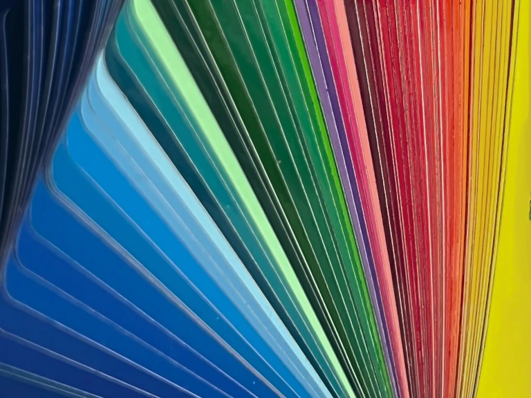
Interior Paint Trends for 2025: Transform Your Space with Colour
As we move further into 2025, the world of interior decorating continues to evolve, with paint colours leading the way in setting the mood, style, and energy of a room. Whether you’re planning to refresh a single room or take on a full home makeover, understanding the latest paint trends will help you create a space that feels both timeless and on-trend. From calming, nature-inspired shades to bold, experimental hues, here are the key interior paint trends to keep an eye on this year.
1. Nature-Inspired Greens
Green continues to be one of the most popular and versatile paint colours for interiors in 2025. Nature-inspired greens, from soft sage to deep forest tones, bring a calming, restorative energy to any space. These colours work especially well in living rooms, bedrooms, and home offices, where a tranquil atmosphere is key.
Why It’s Trending: With growing interest in sustainability and biophilic design (the idea of connecting indoor spaces with nature), green paint offers a way to bring the outdoors in, creating a harmonious environment that promotes relaxation and mental clarity.
How to Use: Consider pairing lighter greens with wood accents or natural textures like linen and stone for an earthy feel. Darker greens make striking statement walls, while lighter greens can create a soft backdrop for a variety of design styles.
2. Warm Neutrals with an Earthy Vibe
In 2025, neutrals are becoming warmer and more grounded. Think warm taupes, soft browns, and creamy beiges. These hues evoke a sense of comfort and connection, making them perfect for creating a cozy, inviting environment.
Why It’s Trending: Warm neutrals offer versatility and timelessness while providing a sense of balance and warmth. With people spending more time at home, comfort-driven colours are a natural fit for creating peaceful, welcoming spaces.
How to Use: Warm neutrals work well in just about any room, from living rooms to kitchens and bedrooms. Use them as a base for walls or ceilings and pair them with textured textiles or soft metallic accents for a touch of elegance.
3. Deep and Moody Blues
Why It’s Trending: Blue is associated with calm and serenity, but deep, moody blues take it up a notch by adding depth and character to a space. These colours create a feeling of richness and luxury, perfect for rooms that need a bit of gravitas.
How to Use: Deep blues are ideal for accent walls or feature pieces of furniture. Consider pairing them with warm neutrals, like beige or terracotta, to create contrast, or complement them with gold or silver accents to enhance the opulence.
Deep blues, from navy to indigo, are making a strong statement in 2025. These rich, moody shades bring a sense of sophistication and drama to a space. They work particularly well in larger rooms or those that are meant to feel more intimate, like home libraries, dining rooms, or bedrooms.
4. Sunset-Inspired Tones
Colours inspired by the warm hues of a sunset—think soft pinks, burnt oranges, and warm yellows—are becoming increasingly popular in interior paint trends for 2025. These colours evoke feelings of warmth, positivity, and comfort, making them perfect for spaces where you want to foster creativity and joy.
Why It’s Trending: As more people prioritize wellness in their homes, sunset-inspired colours provide a mood-boosting, energizing environment. They’re especially great for spaces like kitchens, dining areas, and home offices where creativity and collaboration are key.
How to Use: These colours work wonderfully on feature walls or as an accent colour on trim or moldings. Pair them with white or neutral furniture and soft fabrics to keep the vibe light and breezy, or opt for a more maximalist approach by incorporating vibrant textiles and patterns.
5. Soft Pastels for a Modern Touch
While pastels are often seen as soft and light, 2025 brings a modern take on these sweet hues. Muted tones of lavender, blush pink, powder blue, and mint green are appearing in homes in more sophisticated, unexpected ways. These gentle shades bring a refreshing and soothing quality to spaces without feeling overly playful or childish.
Why It’s Trending: Pastels are being reinterpreted to add subtle colour and personality to a room while maintaining a sense of calm and minimalism. They’re perfect for creating serene bedrooms, bathrooms, or cozy reading nooks.
How to Use: Use soft pastels on all walls or on just one accent wall to create a balanced feel. These hues pair beautifully with natural wood furniture or metallic finishes for an updated, refined look.
6. Rich Terracotta and Burnt Oranges
Terracotta hues are becoming more vibrant and bold in 2025, with deep burnt oranges and rusty reds coming to the forefront. These rich, earthy colours inject warmth and energy into any room, making them ideal for living rooms, kitchens, and even entryways.
Why It’s Trending: As we continue to embrace natural elements in interior design, terracotta and burnt orange are associated with rustic charm and a connection to the earth. These shades evoke feelings of warmth and hospitality, making them great choices for spaces meant to feel welcoming.
How to Use: Use these bold hues on accent walls or in areas where you want to draw attention. They work well when paired with natural textures like wood, leather, and woven materials, creating a rustic yet chic atmosphere.
7. Metallic Accents for a Futuristic Vibe
Metallic paints—think shimmering gold, silver, and copper—are making a comeback in 2025, adding a futuristic touch to interiors. These reflective finishes create a sense of opulence and luxury, perfect for adding a modern edge to your home.
Why It’s Trending: Metallics are being used more sparingly but effectively in design, often as statement accents that bring drama and shine to a room. The rise of high-tech design and the influence of futuristic aesthetics are contributing to their popularity.
How to Use: Metallic paint works well on feature walls or architectural details like doors, window frames, and baseboards. You can also incorporate metallic accents through furniture, light fixtures, or art pieces to add a layer of glamour.
8. Soft Grays and Charcoal
Soft grays and charcoal continue to be a top choice for 2025, offering a neutral backdrop that complements a variety of design styles. These shades are ideal for creating a calming atmosphere without feeling too stark or cold.
Why It’s Trending: Grays are timeless and versatile, allowing for easy integration with a wide range of other colours and design elements. In 2025, the trend is moving toward warmer gray tones that have a bit more depth and warmth, making them feel cozier and more inviting.
How to Use: Soft grays work well as all-over wall colours, while darker charcoal tones are great for creating contrast in accent areas. Pair grays with natural wood accents, matte finishes, or pops of vibrant colour for a modern, sophisticated look.
Conclusion: Fresh Paint, Fresh Vibe
In 2025, the interior paint trends reflect a broader shift toward comfort, sophistication, and creativity. Whether you’re drawn to the serene calm of nature-inspired greens, the rich drama of deep blues, or the warmth of terracotta tones, there’s a colour to suit every mood and aesthetic. This year’s trends encourage personal expression and thoughtful design choices, with an emphasis on creating spaces that feel inviting, dynamic, and timeless.
Which paint trend are you most excited to incorporate into your home? Are you ready to experiment with bold colours or stick to soothing neutrals? Let us know how you plan to transform your space!